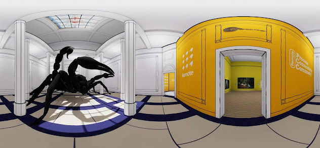
I've just completed my biggest project to date. Blackpool School of Arts (BSoA) REMOTE, virtual graduate exhibition and in this blog post I am going to describe the process I have had to go through and the problems I have encountered on the way. I will try and break it down into sections - Development, Time, Artworks, Build and Refinement. My ability to manage projects and successfully deliver them on time is one of the areas that I am good at... I think I got good at it through planning and coordinating physical exhibitions, in BSoA's gallery and external showcases across the country. I have 20 years of experience doing that.
Development
I knew this project was going to be a big one before I started. This was because I had already decided how the gallery was going to look before I started to build it and how many artworks were going into it. However, I always try and put a couple of hours a week aside where I can think about and test new ideas, new software or alternative environments. So I am now in a position where I have a library of ideas to dip into and apply to whatever project I am working on.
I knew that the gallery was going to hold a lot of work and be hosted on Kuula, so I had to ensure that navigation was easy and that I kept the jump points down to a minimum without impacting (too much) on the quality of the viewing experience.
I created a double-spoke layout with each gallery (room) based on two cells and modular so it could be expanded as artworks came in. I also created a simplified map to aid navigation.
I knew it was going to take a long time to put all this together, so I broke it down into stages to help me work out when I needed to start the process in order to hit the deadline...
- Gallery Design (2 days).
- Get the work from participants (deadline for submission was 3 weeks before the launch date, but it actually took a week of chasing beyond that).
- Build and render (1 week).
- Upload to Kuula and build tour (1 day).
- Add extra info - bios, links and other images (1 week).
- Error checking and correcting (3 days).
- I finished the project late evening the day before the official launch.
You can see that the most problematic area was getting work from students (which is why I gave it three weeks and not two) and this was mainly because it was beyond my control.
I should point out that within this time frame there was more than one point of no return. The most significant one came after the build and render stage as that was the point that an installation render (photograph) was taken of the gallery and artworks. If any exhibited images needed to be changed then it would need a considerable amount of rebuilding and rendering in UE4.
Artworks
Collecting artwork from the students turned into the biggest task. Photography and design-based pieces were fairly straightforward to collect as 99% of them came as digital files. However, 2D and 3D craft-based artworks had to be photographed (of course) before they could be added to the gallery.
I received a lot of photographs taken by students, usually with a phone and most of those needed considerable work in Photoshop to straighten, colour correct and crop. I photographed a lot of work on display on campus and that took me about three days and it also needed a small amount of Photoshop work (it all adds up).
Build
I designed the gallery to be modular and expandable and had created a number of room modules that could be easily snapped together depending on the number of artworks, which worked very well.
All the artwork files needed to be imported to UE4, turned into a material, attributes added (matte finish), placed into a prefab' frame or canvas (which some of my students helped me to design), and placed into the correct room at a size that worked.
The biggest problem I encountered at this stage was creating contrast between exhibited artworks. Because there were so many artworks, I could not go down the idealistic 'one room, one painting' route, so I had to rely on a traditional approach of putting many artworks in the same room. I carefully used scale and spacing to differentiate between the individual works... this process took lots of trial and error to get right (to get it to fit together well).
I also created a couple of 3D elements, especially for the fine art courses as it would not always suit the work to try and fit it into a rectangle or square. I have learned to do this in Photoshop. I was also given a 3D sculpture by a student, whose work ended up being the front piece in the HE foyer... the large black scorpion!
Once the gallery was complete I had to create a render for each viewing point or Kuula hotspot... there was 70, but it only took half a day to create them.
The next step was to upload the renders to Kuula and link them together with hotspots This was an incredibly complex task! I had to draw a large plan on the wall to help me...
This part is easy to dismiss but very important in ensuring a professional and polished experience outcome. I sent a link to the exhibition out to participants so they could check it and tell me about corrections... I received a tidal wave of them! The worst being missing work, as that meant going back to UE4 and rebuilding, rendering and 360 capturing every point from which the addition or change could be seen (to ensure continuity). This led me to my only late night of the project a few hours before it went public.


