This years VR projects are rolling in and now semester one is over, I have the time to complete them.
I start with a big breakthrough. Accurate reflections!
The next big project is a virtual version of the 75th Blackpool Seasiders exhibition. And it is big. 50 schools, all exhibiting at least 10 artworks each. The image above is of my starting space, based on the college gallery. I have used it before, but every time I use it I update it... this time, as well as the shiny floor, it includes better hanging lamps, better textures and updated paint scheme.
The VR bit is the easy part. Most of the hard work will be completed it Photoshop. I am replicating the real exhibition poster/panel layout, so all the work from each school will be put into the same image file. I have included a 360 tour I took of last years exhibition to illustrate what it usually looks like and it is going to look similar[ish] in VR...
I was tasked with creating a whole school virtual exhibition... for over 150 students! both FE and HE. I used the gallery I created for the BA Photography students and used it as a base for the degree students and created a completely new space for FE. You can view the gallery here -
EDIT (5 Jan) I created a fly-through video for social media, but forgot to add it to this blog... it's a bit jumpy but works fine on Instagram etc.
I tracked most of this build on Instagram, so please have a look at my account and follow me... @cassetta.frame
If you are reading this blog and feel you can add something to my research then please comment… even if you are correcting me or don’t agree with something that I say.
The covid-19 lockdown has seen an explosion of VR art galleries. There are now too many to keep track of. I have picked out a number of University graduate exhibitions for comparison to my own (later).
University of West London
Wow, what a riot of images and information. I am not sure what else to say... rock and roll! I am not sure what they were trying to achieve, but it is very hard to browse or concentrate on anything. To be fair though, it is for an advertising and PR, so probably not designed by a creative person. It was created in Artsteps.com online app.
North East Scotland College
Better than West London and made in the same artsteps software. Nicely designed and they have made a better use of scale for impact, but it is still very crowded. This small college from Scotland easily beats most University VR exhibitions. A very minor point - the walls are a bit thin.
Brunel University London
They have taken social interaction as the starting point for their VR exhibition. You are given an avatar and you explore the gallery amongst other avatars... the idea being that you can interact and chat with them. Great for the private view. However, I spent most of my time hiding from the other avatars as I was petrified they were going to speak to me! One downside is access to it. you have to click about six or seven links before you can get into it.
Liverpool School of Art and Design, LJMU
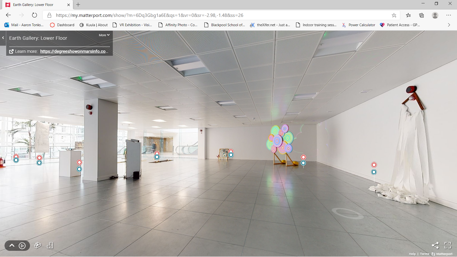
I like the ambition of this 'experience', but it is very glitchy and takes up to five minutes to get through to any work... It starts with an animated landing on Mars, after which, icons representing different students appear in the sky. You are meant to navigate through and click on the icons to view the artworks, which it does through a 360 degree photographic tour of the installations in a shopping centre, utilising Matterport (similar to Kuula.co). Mad, but maddening! They should have chosen Matterport and not bothered with the animation and 3D stuff.
Northumbria University
I like this exhibition. It is a tongue-in-cheek 2D version of everything we have seen above. It makes you question why we feel the need to create a very complex virtual exhibition as they have managed to create an easy to navigate and fun showcase utilising what looks like the plans for their now-cancelled grad show.
I have a couple issues with what I have seen. The big one for me is, why has all the work been installed so close together? Virtual space is infinite and scaleable, so there is no excuse. Just think how much more sophisticated North East Scotland College's exhibition would be if they gave everyone just a little bit more space. Also, you don't need portraits of the artists next to their work. The only people who are going to appreciate that are their parents.
The second big issue is download speed. The network speeds in your area may be very different from mine, so one has to design with the lowest common denominator in mind, LJMU. Also, navigation and ease of use can really impede the viewing experience. Every click of the mouse is the equivalent of a set of doors or flight of stairs in a real gallery and if you've gone through four doors and climbed three flights of stairs, then the work better be worth the effort. The experience must not overshadow the artworks!
Finally, an observation of traditional websites. The web page based grad showcases are way too daunting to attempt to navigate. They are either based around a great long list of student names or pages full of competing artworks. They may be cleverly and beautifully designed, but they can be very overwhelming. A final point here is how much better a nicely built 3D virtual gallery allows you to browse and navigate diverse (quality and theme) artworks... certainly compared with some of the webpages I have seen.
For comparison. This is a screenshot of Tubes 3D gallery, a commercial magazine based space. The artworks are shown at original size.
If you are reading this blog and feel you can add something to my research then please comment… even if you are correcting me or don’t agree with something that I say.
Working with digital imaging professional Richard Weston, we produced a virtual graduate exhibition for Blackpool School of Arts photography students...
I created the gallery space in UE4 and Richard used Tour Weaver software to create an interactive tour. You will notice that I have used the same gallery that I have been recently developing, but I have introduced side rooms designed to work best with 360 low res rendering in UE4.
I like the way that Tour Weaver straightens and zooms through to the next viewing point. It works a lot better than Kuula. However, it does not give you the option to view in mobile VR via Google Cardboard, which is a bit of a miss as VR stuff is hot at the moment. I am not a great fan of the labels and is something I need to think about moving forwards... maybe I should add them in UE4.
The gallery does give one a sense of how a particular piece of artwork would work in an exhibition space at a given size, so it works on that level, but it's never going to as good as full VR.
If you are reading this blog and feel you can add something to my research then please comment… even if you are correcting me or don’t agree with something that I say.
I have just finished creating a virtual gallery for a lock-down Instagram project called 21 Day 21 Photos. I say 'virtual' as it is not true VR. The most important thing about this gallery was that it was accessible the maximum amount of people possible via the internet. Not everyone has a VR headset, so it was important to build it on a platform that could be viewed via a computer screen or mobile device. This was the first constraint.
The second constraint surrounded the 360 export resolution on UE4... I should say that other game/3D design software may well export at a higher resolution (UE4 exports at 4096 x 20480, but I have not the time to learn them. This meant that the images could not be too small or too far away from the camera, or they would look pixelated and soft when the viewer zoomed in to get a better view. So I designed a fairly small gallery based on octagonal rooms so that all the photographs faced the centre and camera.
I built the gallery in UE4 and used an online 360 photo and tour application - kuula.co - to host it. It was really easy to use, and the pro version allows you to add hotspots that allow you to teleport around the space. It also allows you to add info buttons which means I could show high res versions of the images in a pop-up.
Overall, it has worked quite well. I have created an effective gallery that can be viewed on a computer screen, mobile phone or tablet and via VR headset. You can also view it in faux VR via Google Cardboard. It is not cutting edge, but it impresses all who have seen it and does the job it is meant to do.
If you are reading this blog and feel you can add something to my research then please comment… even if you are correcting me or don’t agree with something that I say.
The current covid-19 crisis could be an opportunity for VR to present a very real alternative to physical galleries and exhibitions.
I have just started to plan and design some sort of 'end-of-year' show for Blackpool School of Arts students, as a way of celebrating what they have achieved during these times of remote learning. So the exhibition needs exhibit up to 200 peoples artworks!
However there are some big hurdles to overcome. The most obvious being that only a very few people have access to a usable VR headset. So, at this point, it looks like there will be a combined approach between a VR and screen/web based platform.
At this point (I keep saying this, but things may change dramatically), I am looking to design amazing exhibition spaces in UE4 (for VR), but also capture 360 degree renders for use in an immersive (as much as it can be) web/screen experience.
The main drawback is that the render resolution in UE4 is a little low, therefore the photographs in Tourweaver look a bit soft. However, the images can be re-edited in later using Affinity or Photoshop.
Some more research and discussions with Blackpool School of Arts are to follow and should result in a clearer idea as to the end point for this project. In the meantime here is a screen shot of my exhibition 'complex' in-progress.
If you are reading this blog and feel you can add something to my research then please comment… even if you are correcting me or don’t agree with something that I say.
Out of the two VR galleries I am looking at today, it is exp6Q that proves to be the most interesting when compared to a classic white cube gallery. The other VR gallery, exp8Q, is more conventional and does raise some interesting issues that don't solely apply to VR.
EXP6Q
I designed this gallery to utilise features unique to VR. In this case, the teleport. The gallery built on a vertical axis and the artworks are viewed from a series of platforms accessed individually via teleport.
Most of my galleries have been exploring scale and the relationship between the gallery, artwork and viewer, usually based around very large spaces and large artworks. This is mainly because I do not have access to very large spaces outside of VR, so I have been ignoring the smaller, more normal scaled spaces usually associated with everyday life. However, in this simulation I have exhibited the artworks at a more normal size.
The restrictive nature of the walkways encourage the viewer to move in close to the artworks and the scale of the works are not so important. The viewing experience is quite intimate, even though the wider dark surrounding emptiness is possibly overwhelming or oppressive (I am undecided).
This gallery could potentially be a restrictive experience. But is not! The platforms and ledges encourages the viewer to consider and negotiate the path they take through the gallery, and they can do this at their will. It does raise the question as to whether large open exhibition spaces are the best for visitor experience, as they can be left without a clear path to follow. Indeed, gallery EXP8Q, exemplifies this difference. Gaston Bachelard's intimate immensity comes to mind in this instance and well describes this simulation.
This gallery highlights the relationship between the viewer and the space, the viewer and the artworks and the relationship between the space and the work - This gallery is not a container and I need to have a careful think about what it actually is!
I am not sure whether it completely works as a gallery, as negotiating it is not particularly intuitive and it certainly does not make sense with the exhibited photographs. Perhaps it would work better if it was part of a conceptual piece or series of artworks that connect to, or reflect the viewing experience.
EXP8Q
I tried to imbue a sense of weight and space in this gallery. I wanted the visitor to feel the weight of the building surrounding them. I tried to include different spaces for different sized artworks and I wanted the works to be the brightest objects in there so spot-lit them and coloured the walls and floors a mid grey. I also dictated the starting point which sited the visitor in the middle of the gallery, under the claustrophobic hanging wall, and able to see into most parts of the space.
The first thing that hits you is the darkness, it is oppressive, but the spotlit artworks to stand out very well. One does feel a little bit lost in the larger spaces but the artworks are also very large. However, they are possibly too large as the viewers attention tends to be centred on the lower part of the photographs. This would not be a problem if the photograph read from bottom up, but not all images follow this aesthetic. Of course, this is something that translates to real life and it seems that there certainly is a maximum size for this style of artwork within a gallery.
The overhung walls in the centre corridor work well as exhibition walls for smaller artworks, however the other sides (of the same wall) does not because they interfere or are interfered by the works displayed on the main (dominating) walls in that room.
I think this space works quite well. I like the darkness and contrast of the gallery length skylight. The spot-lit artworks are well presented and I like the differentiation of sizes. However, as mentioned above, one feels a little lost in the larger spaces and I need to think about trying to add a sense of direction. In the past, and in real life, I have managed to use the careful placement of artworks to pull the visitor around an exhibition, but the vastness of this space and the hanging wall have removed the ability for me to do that...
I am currently moving the VR project into it's own office. Very exciting! and it will be interesting to see how this affects my future designs and direction.
If you are reading this blog and feel you can add something to my research then please comment… even if you are correcting me or don’t agree with something that I say.
I have been trying to improve the realism of the VR simulations. One area that I have managed to improve is the surface textures within my galleries. I have been relying on either flat colour (no detail) or example textures that come as standard with UE4. These textures are a little low on resolution and the image part of the textures are of quite a small area, so one tends to notice them repeating over large or long surface areas... like on a gallery floor or wall!
Even the most pristine surface or gallery wall always has some sort of texture and is why in a simulation the flat colour does not look so real.
The biggest problem is the obvious repeating patterns. And the easiest and effective way of overcoming this was to get rid of the base image entirely. However, the idea was that I use images of texture to create a bump/normal map, but not include the image in the simulation.
I needed original and high quality photographs to base my new textures on and as I am a photographer by trade, this was easy and an enjoyable experience...
I also photographed Blackpool School of Arts Gallery floor. I used these images to create high quality 2048 normal/bump maps and threw away the original photographs (or at least did not use them) I tried to make 4096 versions but UE/Quest could not resolve them so well...
Normal maps for concrete wall and gallery floor.
And the results...
An image of my textures in use... I had to add a light in order to capture the screenshot as the gallery is nicely lit in the Quest but fairly dark on the laptop screen (which could point at an inherent problem?).
For me this is a good technical step forward. I no longer have to worry about repeating materials, I have the quality of texture that I need and together with carefully controlled lighting gives me the level of realism and sophistication that I have been looking for.
My next blog will include some video of my most recent experiments and analysis and evaluation of my most recent galleries.
If you are reading this blog and feel you can add something to my research then please comment… even if you are correcting me or don’t agree with something that I say.
I would like to add more realness to my galleries and I figured I could do this by obtaining more realistic materials for the floor, walls and ceiling. I am not interested in recreating a real gallery, but I do want to use real attributes to create the illusion of realness.
I have tried a number of wall materials, both free and paid but they are relatively small and in areas larger that a couple of metres one starts to see repeating patterns which kills the illusion and therefore the immersive realism of the experience. This is a particular problem if I want to create a long approach to an artwork or utilise an expansive space in my design.
So, I have decided to create my own... and it turns out to be fairly easy. My background is in technical photography so taking good, sharp, exposed, colour balanced photographs of walls and ceilings is fairly straight forward for me. The floors are proving to be a problem, but I know someone with a drone who may be able to help. The main idea here is to capture very large area photographs and create materials that don't have to be tiled so much in the simulations.
Image captured through the Oculus Quest.
I made the above example to test the creation of a normal/bump map. It turned out to be dead easy as there is a filter in Photoshop and piecing the texture and material together is very straight forward in UE4. The biggest problem I've been having is the LOD in the Quest which does not seen to be working as it should, but it could have something to do with the 4096 tile size. However, the initial results are promising.
What should I do next...
Find and photograph large area surfaces (no mean feat)
Colour balance and equalise exposure
Resize to 4096 squared
Alter to smoothly tile
Create a normal map
Partner new material to project (or the other way round)
The floor is a problem as ones feet, tripod, scaffolding or building are always going to be in the way, but if I find some appropriate floors I may be able to enlist some help form a friend with a HQ drone.
I created this floor a couple of weeks ago but was unable to get the height to capture a large enougth area so it is easy to see where it has tiled... the smudgy repeaters are a dead giveaway.
If you are reading this blog and feel you can add something to my research then please comment… even if you are correcting me or don’t agree with something that I say.
Recently I have been exploring the unique attributes that VR can bring to an art gallery. I have been particularly interested in attributes that can allow me to design new and original ways of exhibiting art works.
I have defined the following attributes as being unique to VR -
the ability to create infinite space and/or spaces.
the ability to exhibit artworks at any size.
the feeling of actually being there.
sense of isolation
...I am sure there are more that I have not identified yet...
I have created the following spaces to physically explore these attributes and weight them against the manifesto I set out earlier this year (link). They have all been created for the Oculus Quest.
The first gallery explores the use of space and scale and includes a precipitous walkway leading to a huge photograph provided by artist Helen Kay. The space and scale is maximised by the gorge like confines of the side walls and the inclusion of downward (cliff edge) space increases that feeling. However, the experience, especially for those with vertigo, outweighs the impact of the artwork, so does not pass rule number two of the VR Gallery Manifesto (link)
The second gallery is fairly radical in design and use. It uses the teleport system, that has become the standard way of navigating VR environments, to allow the viewer to move around the space in all directions (including vertical). So the gallery does not have to be navigable on a single plane/floor and does not need stairs to move between different heights. Spherical exhibition spaces lend themselves to this design very well, however, it meant that the exhibited artworks needed to be shown on round panels as square edged ones did not fit so well... and this is where this design fell down as it impinged on the view of the artworks and failed rule number three of the manifesto. But this does not mean the concept failed completely and is an area I want to explore in more detail soon.
An interesting observation was pointed out to me, that the design is very panoptic and almost allows the visitor to see all the artworks from the central room, but does not allow you to see any other artworks when you're stood in front of one... I have explored this concept before (link), but not made the connection to the panopticon.
The final gallery is the most 'normal' in design but has been designed to create differentiated space sizes. It also manages to encompass the over/under/through idea of introducing a sense of exploration to the gallery experience (link). It happily passes all the manifesto rules. However, it has not really furthered my research in the way the other two have but it is a safe and sophisticated design that I am fairly happy with.
If you are reading this blog and feel you can add something to my research then please comment… even if you are correcting me or don’t agree with something that I say.
I had a major breakthrough with the realness of my VR galleries today. This is to do with level of detail (LOD) of my materials - which are the photographs my galleries are exhibiting. The issue is one regarding interference patterns. See example below...
You can see the interference pattern quite clearly on the panel in the back ground.
It was not a huge problem on the Rift headset, but Quest seems to really exaggerate it, so I had to find a solution. My understanding was that UE4 sorted it out automatically, but it turns out that it will only do so if the image dimensions are to the power of 2! So I experimented...
Images to the power of 2 - 1024 square on left and 1024 x 2048 second left and originals on the right.
...and it worked. the problem has been totally solved...
The example looks a little blurry from the screen shot, but the Quest resolves if beautifully as you get closer. and the interference pattern is no longer a problem.
I now have the massive job of correcting all the images in my current galleries! However, it does throw up a major drawback of learning to use a piece of software through trial and error and it is that sometimes one does not even know that there is a problem and that the problem has a specific name and often a very straightforward fix. This is exaggerated by the fact that I do work in a bit of a vacuum and don't tend to meet people with knowledge in this field as often as I should.
If you are reading this blog and feel you can add something to my research then please comment… even if you are correcting me or don’t agree with something that I say.
Because the Oculus Quest is cable free, there is potential to take advantage of a larger floor area, therefore allowing the viewer to move around a VR gallery freely without having to teleport. In this first experiment I translated the corridor measurements outside my office into a basic VR simulation using UE4 and then set up a guardian floor area in that same location.
Image at end of simulation by Helen Kay
It worked fairly well, except that the guardian floor area did not allow me to map the whole length of the corridor. I seemed to be limited to an area that was about six meters long, so this simulation did not have the intended effect... for me anyway. However, my students loved it because of the precipitous nature of the simulation and it actually turned into a great way of introducing newcomers to the possibilities of VR technologies, e.g. the ability to enter a new type of believable space.
5.5m x 5.5m square gallery.
I used the college gallery to try and work out what the largest guardian area could be defined and it seemed to be about 6m x 6m. I built a basic gallery based on those proportions and while it was nice to walk around teleport free, it felt small and constricted and (of course) did not take advantage of the immense possibility of VR space. However, I do think there is scope for a larger guardian area that allows greater free movement within a simulation to increase the immersiveness of the experience.
If you are reading this blog and feel you can add something to my research then please comment… even if you are correcting me or don’t agree with something that I say.
If you are reading this blog and feel you can add something to my research then please comment… even if you are correcting me or don’t agree with something that I say.