Monday, 28 February 2022

Music... in an online gallery?

I have always avoided virtual galleries that come with a sound track, and I have certainly never thought of adding one to my own! I didn't think it was appropriate. However, I was approached by a degree music student from UCLAN and asked if I would consider one and if they could make one for me. Yes, why not, I thought I should give it a go, and less than two weeks later received the audio file that I have attached to the gallery below. Have a listen...


Here are some rambling thoughts on it so far (there is going to be a guitar track added to it later). In no particular order (or indeed, sense) -
  • It’s quite dramatic but has a nice, tapered start which softens it... so it gives one time to turn the volume down or hit the mute button if needed, which is not a bad thing… some sound tracks to exhibitions are too ‘perky’ and ‘jazzy’. 
  • It does not feel repetitive for the time one may spend in the gallery, which on average is less than 5 mins.
  • It feels bespoke, like it has been made (or very carefully chosen) for the exhibition, which of course if has!
  • I feel the interaction between music and the photographs changes nicely with each piece. I don’t think there are any that are completely unsuited. I like that interaction, as I feel it adds another layer to the artworks. However, the artists may not agree. 
  • I think it works for the exhibition as a whole. Which is no mean feat, as there are dramatically different works on show. 
  • I think the music resembles my ambition when curating mixed artworks... I am always looking for the ‘middle way’, not too light or dark, high or low, happy or sad. Some people ,may not agree, say it’s boring or dull, needs more life, but one always has to remember that in an art exhibition, the work is the most important thing. 
Whilst it is an interesting addition to the exhibition, I am still not sure if it should be there. However, the visitor can always mute it.

If you are reading this blog and feel you can add something to my research then please comment… even if you are correcting me or don’t agree with something that I say.

Wednesday, 22 December 2021

The Grand Old Dob Of Yen

I created a gallery that complemented the unencumbered mark-making and purest form of expression found in abstract painting and it was a joy to design and construct. You can learn a lot by watching a child draw and paint.


If you are reading this blog and feel you can add something to my research then please comment… even if you are correcting me or don’t agree with something that I say.

Friday, 5 November 2021

Why Kuula?

I have been asked a couple of times recently as to why I have been using Kuula.co to present my virtual galleries, when there is far more complex and immersive web-based software out there.

The answer is a simple one - Accessibility! - this developed from the needs of my students, many of whom have limited access to technology. Revoe is an area of Blackpool, just a stones throw away from my office and it is the second most deprived area in the UK (the joke being that it is so deprived it cannot even make 1st on the list!). It is not typical, but is part of our catchment area for students.

So the technology I use has to be accessible by a broad range of screen-based tech that can be up to 10 years old!

I have explored other tour based software, but Kuula has become my preferred choice, as it loads quickly - small file size, is stable and easy to navigate.

I hope to move forward into more immersive platforms in the future, but I feel it must be dictated by my audience.

My next project in nearing completion and I can't wait to share it with you.

If you are reading this blog and feel you can add something to my research then please comment… even if you are correcting me or don’t agree with something that I say.

Tuesday, 31 August 2021

REMOTE: Reflection (Navigation)

In this post, I am going to examine and reflect on the navigation and architecture of the gallery. Navigation is arguably the most important aspect to get right for the visitor. I think Kuula's software and navigation are fairly intuitive. However, to move around the gallery, one must click on a link (jump point) that takes you to a different 360 viewpoint.

I think, because of the nature of a VR tour experience, the visitor can be fairly forgiving when it comes to the number of links they have to click to get to the important information. But I think this gallery really stretches the user's patience. For example, to get to the end gallery for HE Fine Art (fairly representative of site visits) one must click on nine links! six more than an acceptable three. To negate this, I added a map, but that still entails six clicks to get to the same point. This is still unacceptable. 

    The floorplan/map

The number of visitors per click reduce considerably over that journey and is really interesting to unpick (and backs up a lot of research into this area).

CLICK            NUMBER OF VISITORS (31/08/21)

Long route

0                        1843 (start)

1                        672

2                        427

3                        213

4                        303

5                        390 (first link in HE fine art gallery)

6                        415

7                        383

8                        401

9                        94 (furthest link in HE fine art gallery)

Via Map

0                        1843 (start)

1                        570 (map)

2                        390 (first link in HE fine art gallery)

3                        415

4                        383

5                        401

6                        94 (furthest link in HE fine art gallery)

The starting figure is split three ways between the HE, FE galleries and the map. After that, the number of visitors reduces a lot over the next two/three clicks. Click numbers for four to eight (long route) and three to five (map) deviate quite a lot due to people revisiting links as they move around the gallery. However, 94 visits to the furthest link tell us that the number of individual visitors declines by the time they get there. 

I don't have access to more detailed click data so it's hard to work out exactly how people are moving around the gallery and producing the unusual numbers. But the reduction from the first to the last click in the gallery (390 to 94) shows that the number of clicks drop significantly and must represent a degree of visitor fatigue.

I attempted to bring down the overall number of clicks by introducing the map. However, a map that represented all the rooms in the gallery would have looked incredibly complex, especially as there is a lot of overlap ...one of the useful things about virtual galleries is that they can occupy the same space, but it makes creating a map of the structure very difficult!

    Overlapping galleries circled.

The number of clicks-to-data is something I must address seriously going forwards. It may be acceptable in this context, but certainly not in a more commercial environment. Perhaps, a creative way around this will appear. Any ideas?

I based the galley design on the architectural features of the Blackpool School of Arts art deco campus. Especially its foyer and staircase. I think this would have worked well, from a navigation point of view, if I had stuck to the original concept, as I did for the FE galleries...

    The art deco foyer at BSoA's Palatine building

However, when I was presented with the scorpion (created by a HE fine art student), I saw an opportunity to mix things up a bit and utilise it as an oversized sculpture in the HE foyer, because I thought the space seemed a bit empty. Unfortunately, this removed the central jump-point which would have made navigating to the different galleries a lot easier. Instead, I was left with a corner view, such that the columns covered the signs and doorways to some of the galleries.

    Hidden signage and doorways circled

I decided to go with the giant scorpion and accept that it was going to compromise some of the navigation, but I thought it was worth it at the time and felt it made the experience more interesting. I am not so sure now. I think the nod to LBTGQIA+ and Pride Month, in the FE foyer, is more subtle and sophisticated (and of course it doesn't hinder the navigation).

    The FE foyer with a clear view of signage and doorways

The navigation through the individual exhibition spaces works very well visually, with the jump-points based around a cellular plan. I used an asymmetric approach to the design and you'll notice that the doors and layouts are offset which means the viewer can decide whether to access the rooms fully or not. This is probably the most successful part of the gallery and is most likely down to classical architectural design theory being put into practice. Indeed (as I have mentioned before) I have a growing interest and respect for architecture, that I want to pursue more as the VR Gallery Project moves forward.

    This layout gives the visitor the choice of whether to visit a particular room when navigating the gallery

If you are reading this blog and feel you can add something to my research then please comment… even if you are correcting me or don’t agree with something that I say.


Tuesday, 17 August 2021

REMOTE: Reflection (Spacing and Layout)

My latest gallery, REMOTE, has been live for a few weeks and it's now a good time to look back at it critically. I want to take a fairly in-depth look at; spacing and layout, navigation, design, information and overall experience, so I will analyse each area in its own blog post. Starting with...

Spacing and Layout

I have an ideological idea as to how a virtual exhibition should function. I try and stick to these ideas (rules, if you like) as much as I can. However, for these larger projects, I have to make some quite large compromises and they start to look like some VR galleries I have been quite critical about in the past. This is mainly about the number of works on display and the space attributed to each of them and this is why it forms the first part of my reflection.

There are over 200 artworks in this exhibition and they are spread between rooms on a course-by-course basis. I designed the space to be expandable, so I could add new spaces as I needed them or new work appeared (new works kept appearing right up to the day before it went live!). However, every new room adds another two jump-points (or links) for the visitor to navigate, and previous data has shown me that every click of the mouse equals about a 50% reduction in visitors. So I had to keep the number of rooms (or jump-points from the entrance) to a minimum - which meant that each one had to hold more work.

I think I got the ratio of work to space to links about right for the size and type of the exhibition, but I don't have to be happy about it. It does feel a little bit too crowded. The frames do a fairly good job of creating space and protecting the context of individual works, but they have been arbitrarily distributed without much thought given for the appropriateness of them... but I did use my experience and went with what felt right without too much analysis as to why. I am not entirely certain that these frames work in the same way as traditional frames. Are they just a design gesture? Perhaps they are not needed in a traditional sense.

Different styles of framing have been used to differentiate between works. Successful?

A fairly successful device that I did use to differentiate different artworks, throughout the exhibition was size. Again I chose sizes intuitively and whilst some exhibitors may not be very happy about it, feels right (to me).

No frames in here. But the different sizes (successfully?) differentiate between different artists.

The layout of work in this exhibition has been fairly successful, but not ideal. It may be that I am never going to be able to reconcile the amount of work exhibited against the number of galleries and user experience. So in light of the size of the project, this area has worked out relatively well.

My next blog post will analyse the navigation and architectural layout of the gallery.

If you are reading this blog and feel you can add something to my research then please comment… even if you are correcting me or don’t agree with something that I say.

Wednesday, 7 July 2021

Project Management - VR Gallery Process

 I've just completed my biggest project to date. Blackpool School of Arts (BSoA) REMOTE, virtual graduate exhibition and in this blog post I am going to describe the process I have had to go through and the problems I have encountered on the way. I will try and break it down into sections - Development, Time, Artworks, Build and Refinement. My ability to manage projects and successfully deliver them on time is one of the areas that I am good at... I think I got good at it through planning and coordinating physical exhibitions, in BSoA's gallery and external showcases across the country. I have 20 years of experience doing that.

Development

I knew this project was going to be a big one before I started. This was because I had already decided how the gallery was going to look before I started to build it and how many artworks were going into it. However, I always try and put a couple of hours a week aside where I can think about and test new ideas, new software or alternative environments. So I am now in a position where I have a library of ideas to dip into and apply to whatever project I am working on.

I knew that the gallery was going to hold a lot of work and be hosted on Kuula, so I had to ensure that navigation was easy and that I kept the jump points down to a minimum without impacting (too much) on the quality of the viewing experience.

I created a double-spoke layout with each gallery (room) based on two cells and modular so it could be expanded as artworks came in. I also created a simplified map to aid navigation.


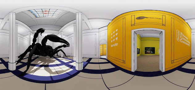
Much of the architecture and design features were based on BSoA's main art deco building and decoration and I had to draw and sketch all the surface and material features because I wanted the gallery to have an illustrated or drawn look... I wanted to try something different to 'real' spaces.


Time

I knew it was going to take a long time to put all this together, so I broke it down into stages to help me work out when I needed to start the process in order to hit the deadline...

  • Gallery Design (2 days).
  • Get the work from participants (deadline for submission was 3 weeks before the launch date, but it actually took a week of chasing beyond that).
  • Build and render (1 week).
  • Upload to Kuula and build tour (1 day).
  • Add extra info - bios, links and other images (1 week).
  • Error checking and correcting (3 days).
  • I finished the project late evening the day before the official launch.

You can see that the most problematic area was getting work from students (which is why I gave it three weeks and not two) and this was mainly because it was beyond my control.

I should point out that within this time frame there was more than one point of no return. The most significant one came after the build and render stage as that was the point that an installation render (photograph) was taken of the gallery and artworks. If any exhibited images needed to be changed then it would need a considerable amount of rebuilding and rendering in UE4.

Artworks

Collecting artwork from the students turned into the biggest task. Photography and design-based pieces were fairly straightforward to collect as 99% of them came as digital files. However, 2D and 3D craft-based artworks had to be photographed (of course) before they could be added to the gallery.

I received a lot of photographs taken by students, usually with a phone and most of those needed considerable work in Photoshop to straighten, colour correct and crop. I photographed a lot of work on display on campus and that took me about three days and it also needed a small amount of Photoshop work (it all adds up).


Build

I designed the gallery to be modular and expandable and had created a number of room modules that could be easily snapped together depending on the number of artworks, which worked very well.

All the artwork files needed to be imported to UE4, turned into a material, attributes added (matte finish), placed into a prefab' frame or canvas (which some of my students helped me to design), and placed into the correct room at a size that worked.


The biggest problem I encountered at this stage was creating contrast between exhibited artworks. Because there were so many artworks, I could not go down the idealistic 'one room, one painting' route, so I had to rely on a traditional approach of putting many artworks in the same room. I carefully used scale and spacing to differentiate between the individual works... this process took lots of trial and error to get right (to get it to fit together well).


I also created a couple of 3D elements, especially for the fine art courses as it would not always suit the work to try and fit it into a rectangle or square. I have learned to do this in Photoshop. I was also given a 3D sculpture by a student, whose work ended up being the front piece in the HE foyer... the large black scorpion!


Once the gallery was complete I had to create a render for each viewing point or Kuula hotspot... there was 70, but it only took half a day to create them.

The next step was to upload the renders to Kuula and link them together with hotspots This was an incredibly complex task! I had to draw a large plan on the wall to help me...


Before and after

The final step was to add pop-ups that included extra images, info and links for each student... there were 140 students taking part so this took some time.

Refinement

This part is easy to dismiss but very important in ensuring a professional and polished experience outcome. I sent a link to the exhibition out to participants so they could check it and tell me about corrections... I received a tidal wave of them! The worst being missing work, as that meant going back to UE4 and rebuilding, rendering and 360 capturing every point from which the addition or change could be seen (to ensure continuity). This led me to my only late night of the project a few hours before it went public.

Conclusion

So, I just wanted to document exactly what goes into these projects, to justify it to myself and give others an insight into the process. Designing and building the galleries is getting quicker, however, it is everything else; the artworks, info and navigation that takes time and sometimes these are out of my hands and I am relying on other people. So, as I mentioned earlier, I always give that part the largest amount of time.

I will follow this post up with my critical thoughts on the gallery once the dust has settled and another on user experience.

If you are reading this blog and feel you can add something to my research then please comment… even if you are correcting me or don’t agree with something that I say.


Monday, 28 June 2021

Friday, 7 May 2021

Minecraft Art Gallery

One of my students, James Hanks has created a virtual gallery for his photography work in Minecraft. He talks about the gallery in this video -


There are a couple of things I like about this project. James's exploration of scale and alternative viewing points, above and below is really interesting as he is clearly questioning tradition. He also experiments with different viewing experiences between a 'traditional gallery' and an external exhibition. Again, questioning the norm. He offers partial control of the experience to the visitor, by giving them a choice between artificial and natural light (sim notwithstanding). The final thing, that I really like, is how an unexpected change in the weather completely changed the experience and context of the artworks!

I would be interested to see how James manages to market this exhibition and idea (he talks briefly about it in the video).

If you are reading this blog and feel you can add something to my research then please comment… even if you are correcting me or don’t agree with something that I say.

Friday, 30 April 2021

Freya Fine Art - VR gallery

I really like the interactive nature of Freya Fine Art's VR gallery. It is a web-based (webXR?) virtual gallery. I like the way you can move smoothly around the space and how it allows 3D works and installations to 'do their thing'. You can tell that the designer has thought carefully about the experience; it is well laid out, nicely lit and a pleasure to use (and they have not included seats!). This is the kind of interaction I am looking to step up to, as well as the ability to scan and include sculptural pieces. You can view this great gallery here - https://freyafineart.com/ - I have yet to view it through my Quest 2 and I don't know what the load speeds would be like on slower data speeds. 


If you are reading this blog and feel you can add something to my research then please comment… even if you are correcting me or don’t agree with something that I say.

Wednesday, 21 April 2021

Virtual Art Galleries: What happens now?


My thoughts have recently focused on what happens now we (in the UK) appear to be coming out of lock-down and covid protection measures. Is there a future for VR/virtual galleries? and what will they look like?

A positive thing to come out of the crisis was the sudden need for alternatives to 'normal' art galleries... which was great for me as it allowed me to use my skills to help provide it (and improve them on the way).

On the whole, it seems that many people have been forced into confronting technology that they might otherwise have not done so and I have seen the benefits of it. For example, two of my most popular galleries have seen 9000 and 4000 visits, far more than we could have hoped for in a normal onsite exhibition.

It does look like virtual galleries will continue to run alongside real exhibitions. Commercial galleries have seen the benefit in terms of online visitors as well as the indefinite length of low-cost exhibition time. This could either be in a completely manufactured space or even a 360 photographic tour (which would be a lot easier to produce on the back of a real exhibition). Indeed, a number of commercial enterprises have been set up in response to gallery needs during the lockdowns, which will create a virtual gallery to order.  https://emperia.co.uk/art/ and https://exhibbit.com/home/ are examples of this. Public galleries have also introduced virtual exhibitions like these two from The Harris Museum in Preston - https://www.theharris.org.uk/product/the-artful-line-2/ and Open Eye in Liverpool - https://openeye.org.uk/whatson/vr-l-a-city-through-its-people/

On the back of these commercial needs and enterprises, there appears to be more potential for curated online content rather than individual artists web sites. I have noticed that a number of 'normal' gallery websites have started to curate online exhibitions, made up of work by many different artists. These are not necessarily virtual shows; they could just be a collection of images on a page. Normally, art websites are based around the individual (artist), but the lockdown has seen a rise in mixed content, in its own right, and is not something we have seen outside of supporting info for normal curated exhibitions and competition pages. This could potentially feed into a continuation and need for virtual galleries.

We may now see individual artists make use of this technology to self-promote their work. Lock-down has shown people that they do not need to rely on traditional systems to exhibit. Accessible technology has democratised the process, similar to what YouTube has done for grassroots music and film. For example, https://www.artsteps.com/ provides an easy-to-use platform and interface for users to create their own (free!) virtual exhibitions and there of hundreds of self-made galleries to explore.

It appears that lockdown made viewing artworks, in an experiential way, online more acceptable, or at least has shown people that it has worth. Perhaps that will continue into the future where other areas of legacy have yet to reveal themselves.

If you are reading this blog and feel you can add something to my research then please comment… even if you are correcting me or don’t agree with something that I say.

Thursday, 1 April 2021

Cassetta.co.uk

 I felt that it was time that I created a formal portfolio of my VR and virtual gallery projects... so here it is - www.cassetta.co.uk (I thought that cassetta frame was too long).


Let me know what you think.

If you are reading this blog and feel you can add something to my research then please comment… even if you are correcting me or don’t agree with something that I say.

Friday, 19 March 2021

All That Glitters


All That Glitters is the first project I have designed and exhibited that features work from a single artist.

In response to the photography by Richard Weston, I wanted to create something grand in scale and colourful. I also wanted the exhibition to feel like a journey of exploration and discovery.

I used colour from the LBGT+ flag throughout the space but used more muted colours, tones and textures to add neutrality and breathing space in which to view the works. I used wooden slats to create space (a caesura) above the ceilings and texture to combine elements of the larger space.

The things that have worked really well are the glowing LBGT colours at the back of the gallery and the reflection of them on the dark floor. The slats have softened the ceiling and created the idea of space beyond... intimate immensity. The large room positions the main stars of the show opposite each other and the grounding of the smaller works (on the concrete panels) help to reinforce a sense of scale. I think the scale works well in this case... even with the distortion that comes with viewing oversized images in this format.

The things that have not worked so well; are some of the textures do not look real enough, either from being to mottled or contrasty (the concrete panels) in their texture or rendering a little on the soft side (in the corridor). I think the neon signs could have more glow/bloom, then they would look great. I may make some changes to the initial exhibition space as it does not feel 'right'. I think some differentiation in the size of the two photographs on the left will help.

I am really looking forward to my next project. I hope to work with another artist and single body of work. And once again, my design will be created specifically for it. It looks like it will encompass nature-based textures and colours.

Please take a look at the exhibition...

Many thanks to Richard Weston for allowing me to work with his project. He is a Manchester-based photographer. Check out his website - http://westondigitalimaging.co.uk/

If you are reading this blog and feel you can add something to my research then please comment… even if you are correcting me or don’t agree with something that I say.

Wednesday, 3 March 2021

The Virtual Gazette Young Seasiders Schools Art Exhibition

My latest project has been a big one. The gallery design is based on the gallery in Blackpool School of Arts and apart from time spent creating natural lighting, was the easy bit. The biggest part of this project was creating the content... 38 schools, each with at least 10 pieces of work. It only took two days, but I was starting to go crosseyed!

The exhibition was designed to look similar to the normal annual Young Seasiders exhibition. I have included a photographic tour, that I shot and pieced together last year, at the bottom of the page.


Virtual Blackpool Young Seasiders Exhibition hosted on Kuula.co.

Photo tour created for last years exhibition.

If you are reading this blog and feel you can add something to my research then please comment… even if you are correcting me or don’t agree with something that I say.